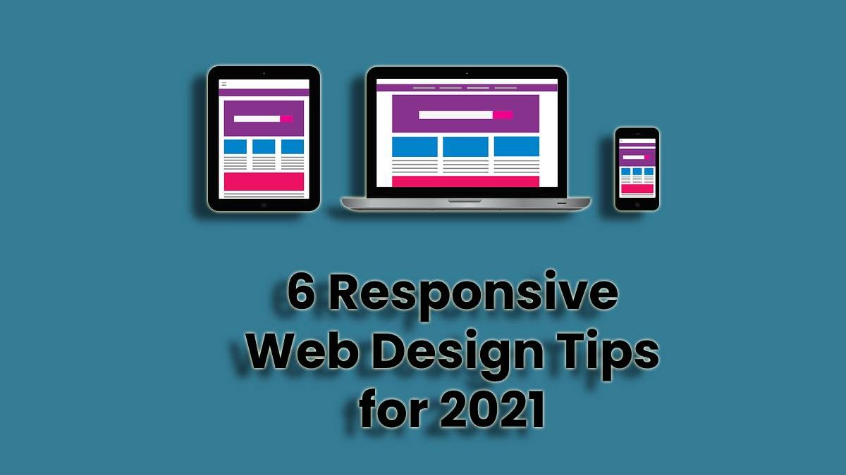
Responsive Web Design Tips
It is no secret that site visitors use various types of devices to access a site, and that’s why no website owner can afford to overlook a responsive web design. After all, it ensures that the content on your site is displayed perfectly regardless of the screen or window size that your user settles for.
That shouldn’t worry you because you can adopt responsive web design tips to achieve that responsiveness. From CSS image resize to certain layouts, this article highlights some of the effective ways to choose.
That said and done, we better dive into them to help you take advantage of all audiences, especially mobile users who are more than a billion and growing each passing day. Take a look at some responsive web design tips for 2021 from the top web design company from Aurora.
-
Table of Contents
Responsive Images
If the images on your site can resize themselves depending on the size of the user’s device, it automatically solves a common responsiveness problem. The trick to applying is introducing a CSS code.
In that code, you have to use a percentage instead of an actual figure for the width. Consequently, the width will not be a set length but rather a percentage of the visitor’s screen. Under such circumstances, the size of the image will always be proportional to the screen regardless of its dimensions.
-
Fluid Layouts
This responsive web design tip is similar to the previous one since it uses a percentage instead of a specific value when styling elements. For instance, if you have a certain element, instead of assigning 300 px, you go for 50% instead.
If you do so, the element’s dimensions will increase or decrease dynamically according to the size of that particular screen or window.
-
Separating CSS and HTML
HTML is an important language when defining the elements, structure, and content of a website and its various pages. People used it to do everything for so long, including defining various attributes such as width and height.
As effective as it is, it threatens web responsiveness explaining why one responsive web design tip for 2021 introduces CSS in the picture. The developer uses two files whereby one contains HTML code, and the other has CSS code.
HTML adds the element, whereas CSS takes care of its layout and design. It becomes easy to define how the content adapts to various screen sizes when using CSS compared to HTML.
-
Flexbox Layout
This is an alternative to the fluid layout that has proven to be quite effective. It is more flexible and dynamic than its fluid layout counterpart. The CSS module comes in handy when you can’t tell the size of contents to include in a container. Its mechanism includes expanding the content or shrinking it to fit the available space.
As a result, if your screen is big, the content expands and vice versa. Why is it better than most of the responsive design tips available? That’s because it has what it takes to do some impossible tricks if one uses a standard HTML element. An excellent example of such a unique property is the justify-content.
-
Media Queries
This is a responsive web design tip that means using CSS3 to achieve responsiveness. It is also effective when rendering content based on the screen size, not forgetting that it also considers the resolution.
The media queries approach is introducing conditions and what happens if they are met. So, it queries the size of the users’ screen and displays the content depending on the size.
Besides resizing the screen’s width that an element takes, it centers it and adds wider margins to make it look normal. It is important to note that the width is usually a percentage.
-
Improving Loading Speed
Unfortunately, web responsiveness often compromises web page loading speed which could compromise user experience. That’s why it is essential to integrate other features that improve the loading speed, or else the visitors may not settle for your site to begin with.
Fast loading reduces bounce rate and ensures that the pages load as fast as possible. Excellent approaches include optimizing images, minification, compression, and caching. Avoiding render-blocking JS is another great idea, not forgetting to choose the right CSS layout.
Conclusion
Web responsiveness is here with us, and as a site owner, you either shape in or ship out. If you want to survive, the latter is not an option. That’s why you need to embrace the phenomenal, and with some of the ways to do so at your disposal, you definitely have a place to start.
Consider content and images alike because none of them matters less than the other. User experience is crucial, and these responsive web design tips can help you take it a notch higher. Visitors appreciate that, and they will reward you for it by coming back over and over again, no doubt.

