“We believe the future of television is apps”, said Apple’s CEO Tim Cook back in 2015 when unveiling the new fourth-generation Apple TV with a built-in App Store. And although this statement is open to discussion, one thing is clear — OTT apps are becoming an appealing way to consume content because they allow users to see what they want, when they want.
There are many streaming devices and set-top boxes that allow users to watch their favorite shows when they want, and Apple TV is one of them. And although Apple TV is outsold by Amazon Fire sticks and Roku, there are 53 million active Apple TV users worldwide — nothing to sneeze at.
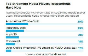
According to Statista, Apple customers are more likely to spend money on in-app purchases and services. All this makes investing in Apple TV app development a highly lucrative idea for publishers and content owners. But designing for the biggest screen in the house can be challenging, to say the least. So, let’s have a look at some of the best practices to help you build a tvOS app that delivers compelling user experiences.
Table of Contents
1. Focus engine
One of the most important concepts in Apple TV design is that something is always in focus. Focus engine is the system that controls focus movement. Unlike mobile or web apps where a user can tap or click on the UI element, Apple TV users must rely on a remote control to navigate the screen by moving from item to item. The focus model must inform all layout and grid design decisions in order to produce immediate and immersive experiences.
The main focus engine principles include:
- A single item can have focus at any given point in time;
- Move focus in the expected direction;
- Use animations to make the focus object clear and obvious;
- Make focused elements of adequate size.
2. Parallax
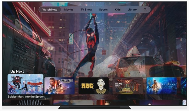
Speaking of focus, Apple TV allows developers to use the parallax effect to clearly indicate what UI element is in focus right now. Parallax is a visual 3D effect that is used for image-based content to create the sense of depth and realism through image layering, transparency, scaling, and motion. Together with animations and color changes, parallax contributes to creating an immersive user experience for viewers.
3. Animations
Animations are also a great way to indicate focus to users. In addition to built-in animations from Apple’s UIkit, you can use custom animations to create a more immersive experience. The rule of thumb is to use animations only in response to a user’s action, keep them subtle, and strive for credibility.
4. Typography
In addition to images, text legibility and clarity is very important for a well-designed smart TV app. Apple uses San Francisco font on all of its platforms, and San Francisco Pro for tvOS.

An important thing to remember here is that you design for a 10-feet experience meaning that a viewer is sitting ten feet away from the screen. Make sure that any text is legible from that distance without unnecessary strain on the eyes.
5. The top shelf
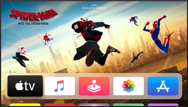
Do not underestimate the power of the top shelf on the Apple TV home screen. This is the place where you can showcase your content in an engaging way that encourages users to dive right in. If you are building a Netflix-style OTT app, you can include a user’s favorite TV shows or top rated movies. The bare minimum is to provide a static image, but you can step up the game and provide dynamic content for a more interactive experience.
6. The tab bar
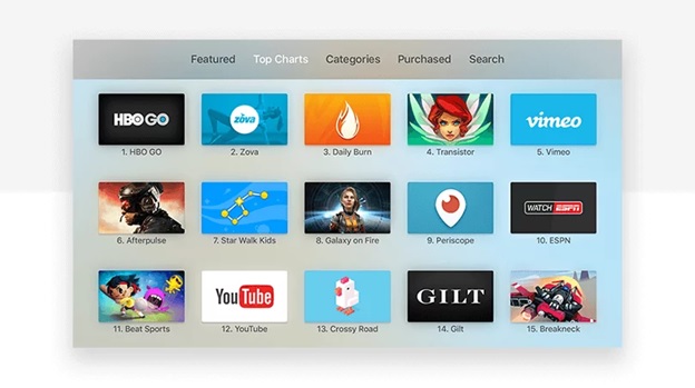
The tab bar is one of the main navigation elements within Apple TV apps. It sits at the top of the screen and takes up to 140px of the content area. The tab bar is used to group and organize content so that it’s easier for users to move between high-level categories. For tab items use text instead of icons and do not go overboard with the number of tabs.
7. Color
Since viewers watch TV from ten feet away, a smart TV UI must have a higher contrast than a regular desktop or mobile app. But keep in mind that colors on a TV screen appear to be more vibrant and saturated. A good idea is to use more subdued, cool colors to help avoid unnecessary strain on the eyes. Other recommendations include:
- Always test your app’s colors on 4K and HD screens;
- Make sure your app works well with both light and dark appearances as users can switch to a dark mode for a more cinematic experience;
- Keep in mind that colors may be perceived differently across different countries and cultures.
8. Overscan
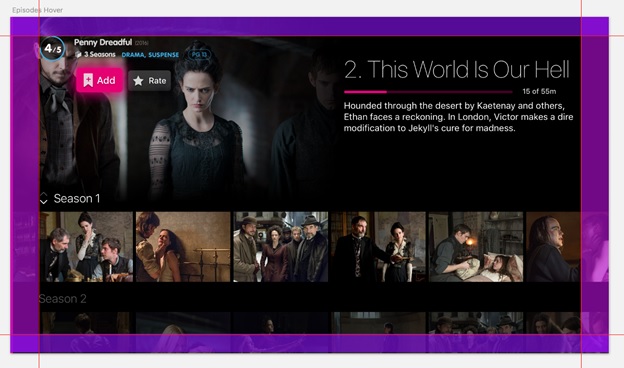
HDTV sets often do not show the whole picture on their screens, cutting up to 5% around the edges. This is called overscanning — a small trick used to ensure image consistency. Keeping the navigation and primary content within the safe zone helps improve usability. The guidelines on safe margins differ from system to system, but Apple tvOS suggests excluding 60 pixels from the top and bottom, and 90 pixels from the sides.
9. Shared experiences
Last but not least, do not forget that a smart TV experience is a shared one, meaning that many family members can access an Apple TV and multiple devices and remote controls can be connected. One way to capitalize on this is to develop an interactive second-screen app to keep your audiences engaged.
Ready to build your own Apple TV app?
As Apple TV is gaining popularity, many businesses start investing in developing their branded solutions to reach wider audiences. But although designing an Apple TV app is familiar, it also has its own peculiarities like getting the focus right, leveraging animations and the parallax effect, streamlining navigation, keeping your content within the safe area, and more.
The key thing to remember is that tvOS design is about being clear, connected, and immersive. In addition, you can always follow the official Human Interface Guidelines to inform your design decisions and create a top-notch Apple TV app that drives engagement.
Author Bio
Olga Ezzheva is a technical writer at Oxagile, a leading software development company. Olga has a proven track record of creating compelling digital content that engages social audiences and drives leads.

