The internet has become increasingly accessible over time, and so have emails. In 2020 alone, more than 300 billion emails were sent and received daily. This number is expected to go up to 376.4 billion daily emails by 2025.
With such a staggering number of emails being sent daily, interactive emails are a great way to stand out, engage your subscribers, and get them to take action.
Let’s dive into why you should use interactive elements in your emails and how can you make them interactive.
Table of Contents
Why Should You Use Interactive Features In Your Emails?
One of the great things about emails is to make them interactive. Here are some benefits of using interactive features in your emails:
- They can help you increase click-through rates.
- They can help you boost engagement and conversions.
- They make your emails more fun and interesting to read.
So if you’re looking for ways to spruce up your email marketing, consider adding some interactive elements to your next campaign. Your subscribers will thank you for it!
9 Interactive Elements to Add to Your Emails
Adding these elements will help you create interactive emails that are both effective and enjoyable for your subscribers.
1) Incorporate Videos
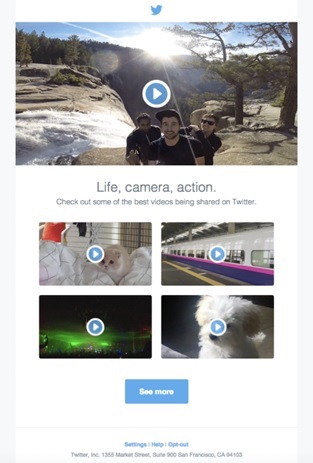
One way to make your emails more engaging and interactive is to include videos. Videos can help capture attention and add a visual element to make your message more memorable.
It can help demonstrate a product or service, show off a new feature, or simply add some visual interest.
If you’re not sure about how to get started with adding videos to your emails, check out this guide for embedding videos in your emails. You can easily add some interactive flair to your next email campaign with just a little effort.
Plus, have a look at the below email example from Twitter.
2) Include GIFs
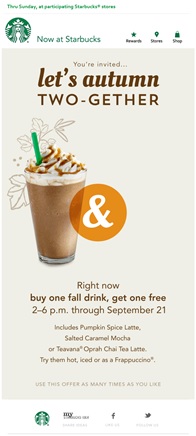
GIFs are a great way to add some personality to your emails and make them interactive. They can help break up the text, add some visual interest, and make your messages more fun and engaging.
Here are a few tips for using GIFs in your email marketing campaigns:
- Use relevant GIFs that fit with the tone of your message.
- Keep them short and sweet – a few seconds is all you need.
- Make sure the file size is small, so it doesn’t slow down loading time.
See the below example from Starbucks, which perfectly employs a GIF to make their email interactive.
3) Add a poll, survey, or quiz
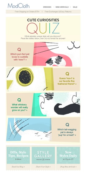
If you’re looking to add a little something extra to your emails, why not try adding a poll, survey, or quiz? Not only will this make your emails more interactive, but it can also help you gather valuable information from your subscribers.
For instance, you can add a clear Call-To-Action (CTA) button like ‘Take the Survey’ with the link to redirect your users to a webpage, where they’ll have to fill out the form.
However, many subscribers are reluctant to take an extra step. So, you can embed survey forms, polls, or quizzes within your emails. This will encourage your subscribers to give immediate responses.
Here’s an email example from ModCloth skillfully using a quiz.
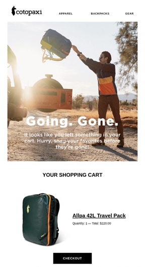
4) Add Live Shopping Carts
Adding live shopping carts is another way to make your emails stand out. This allows recipients to add items to their cart and checkout without leaving their inbox. It’s a great way to boost sales and create a more seamless shopping experience for your customers.
With a bit of work, you can turn your ordinary emails into interactive shopping experiences that will wow your customers and boost your bottom line.
You can take inspiration from the below interactive email example from Cotopaxi.
5) Use Gamification Elements
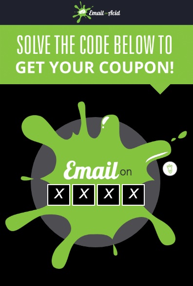
By incorporating game-like features into your messages, you can add an element of fun and competition that encourages recipients to interact with your content. It can be a riddle, puzzle, or jigsaw. Whatever you choose to add, make sure it’s not too complex to solve.
Have a look at the below high-engaging puzzle email example from Email on Acid.
6) Utilize Image Carousels
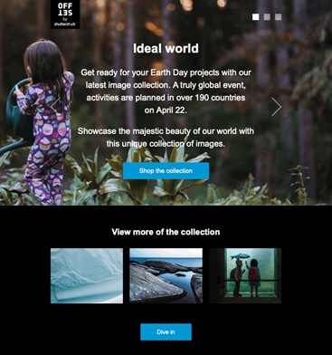
By featuring multiple images in a single email, you can give recipients a more immersive experience that they’ll remember for sure. Therefore, image carousels are a great way to showcase different products or services that you offer.
You can even include links to each image, so your subscribers can learn more about what they see. Look at this example from Offset.
7) Include Countdown Timers
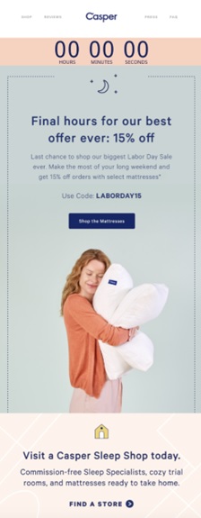
Countdown timers are a great way to add a sense of urgency and excitement to your emails. These can be used in a number of ways, from promoting a sale to announcing the launch of a new product.
When used correctly, countdown timers can be a powerful tool to increase conversions and click-through rates.
Here are some tips for using countdown timers in your emails:
- Use them sparingly. If you use countdown timers in every email, they will quickly lose their impact. Use them only when it makes sense, such as for time-sensitive promotions or announcements.
- Make sure the timer is visible. The whole point of using a countdown timer is to create a sense of urgency, so ensure it is prominently featured in your email.
- Use a real-time countdown. If possible, use a countdown timer based on the actual time rather than a pre-set amount of time. This will add an extra layer of urgency.
- Test, test, test. As with anything else in email marketing, be sure to test your countdown timers before sending them to your entire list. This will help ensure they work as intended and don’t cause any technical issues.
For better understanding, see the below email example from Casper featuring a countdown timer at the top of the email.
8) Incorporate Prominent CTAs
Using prominent CTAs will help recipients take action, whether it’s clicking through to your website or taking advantage of a special offer.
Additionally, by making your CTAs stand out, you can increase the likelihood that they’ll be noticed and clicked on. So don’t be afraid to use color and other design elements to make your CTAs pop!
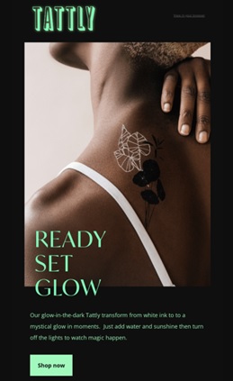
See how Tattly has used a green CTA against the black background to make it pop.
9) Add Image Rollover Effects
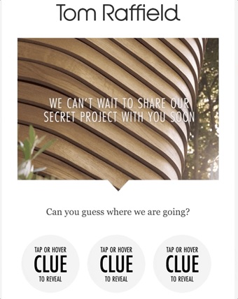
The image rollover effect is a common feature that uses the same principle of highlighted buttons. When the cursor is placed on the image, it switches, making the emails more interactive and improving the overall user experience.
You can create a rollover effect with two or more versatile images of your product to show off a full-scale product preview.
Here’s an email example from Tom Raffield with an image rollover effect.
Interactive Email Dos & Don’ts
When it comes to email, there are definitely some dos and don’ts that you should always keep in mind. Here are a few general tips to help you make sure your emails are always on point:
Dos:
- Use one interactive element per email.
- Prioritize accessibility. Always remember differently-abled people and add alt text in every image, GIF, or other interactive elements.
- Do proper testing to ensure that everything functions as you expected.
Don’ts:
- Avoid using the same features over and over.
- Don’t urge more clicks and actions than needed.
Wrap Up
Now that you’ve learned about different interactive email elements, it’s time to put your new skills to the test. Design a few practice emails and see how your recipients respond. You may be surprised at how engaging and informative these types of messages can be.

