5 Tips to Fix and Redesign Your Website
Website a 21st-century business card to let the audience know who you are. It can increase your credibility, spread your message and influence brand perception. The best one lets visitors determine what a company does within 5 seconds of landing. This in turn may reduce the bounce rate and help your website truly excel. The design is able to feed into the functionality and user experience of your content. The website builder market was valued at $1.46 billion in 2019 and is expected to reach $2.62 billion by 2027 which is growing at a CAGR of 7.73% from 2020. Factors that impact the growth are a swell in internet penetration and mobile phone adoption during COVID.
The figures show the importance of building a website with clear strategies and goals in increasing conversions. It can act as an excellent marketing asset that can make guests want to visit your business again. If you notice a drop in traffic or low loading speed (less than a second), do consider a makeover for competitive advantage. Here’s how.
Table of Contents
1. Upgrade the Navigation
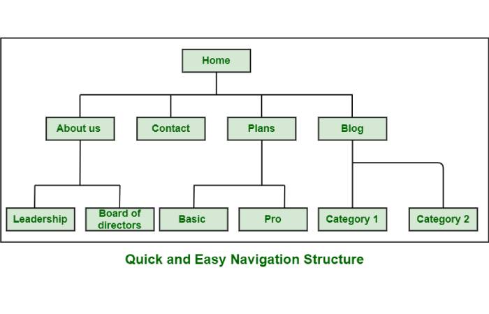
The navigation on your website serves two main purposes: helps in search engine ranking and lets users find what they came to look for. Create customized user flows that will encourage first-time and repeat visitors to stay on the site for a longer time and take an action regardless of their web literacy. Studies found that 50% of visitors will use the navigation menu to orient themselves after reaching via a referral site.

Make it simple, easy and user-friendly. Replace ‘search’ with ‘what we do’ to make it more human. Redo the page structure, use responsive menus, make the best of the footer menu, follow established standards and avoid drop-downs. All of these combined can have a positive impact on your revenue.
2. Reduce Friction
Too long content or flashy animation are likely to distract the visitors. This keeps traffic from converting and slows down the sales cycle. It is because it acts as a roadblock to completing the customer journey. Simplify the process of buying your goods or services. Minimize the work a prospective customer has to do to finish a purchase. Make sure the page is not cluttered which increases the risk of abandoning the website. Place a well-designed search engine right on top of the page. Add many payment options for a comfortable buying decision.
3. Invest in Carousels
These are ‘shifting banners’ or ‘sliders’ present on the homepage. These are modern web design elements that feature brand elements and offer an enjoyable experience to users. A few good practices would be to ditch auto play and make sure it can adapt to all devices and is SEO optimized. Carousels are known to have an average engagement rate per post of 1.92% compared to 1.45% for videos and 1.74% for images. It can display multiple contents in a scrolling format. The most typical ones include news headlines, image galleries, bestselling products or featured articles. Keep the texts short and clear with touch-friendly designs.
4. CTA Text
Make sure the text on the button begins with a verb. For instance, ‘Download the Menu’, ‘Go to Check out, ‘Subscribe to our Blog’ and ‘Get a Quote’ are ideal to tell your customers what to do right after exploring your website.
Try to develop a sense of urgency instead of being pushy. Add ‘free trials’ and ‘free e-books’ to convince a visitor to click. Craft the button in a way to evoke curiosity. Try to exacerbate a problem and offer a rapid solution. Lastly, you can offer rewards, bonuses and freebies to attract and retain customers.
5. White Space or Negative Space
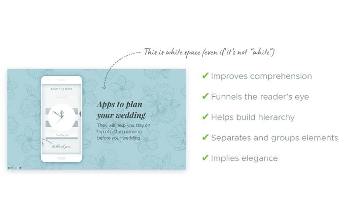
It creates balance and harmony and helps break up pages to boost readability. They can guide eyes to important website elements and avoid crowding. Whitespace is mainly the spacing between texts, images and animations to ensure a clean and elegant web page.

Dropbox, Apple, Airbnb, Chanel and Max Chocolatier are top companies that have added the right proportion of Whitespace to ensure an airy, bright and sophisticated web design.
This keeps your visitors from getting overwhelmed or experiencing a content overload. Start with using wider borders on the page to highlight your information and make it appear approachable.
When guests come home, we try to create a good impression. It helps them feel welcome and encourages them to happily visit again. The same holds true for your brand’s website.
It is a 24×7 sales platform, but customers do not have a lot of time to spare. So, make sure every moment spent on your website counts by following the above-discussed tips.

